in UX / UI
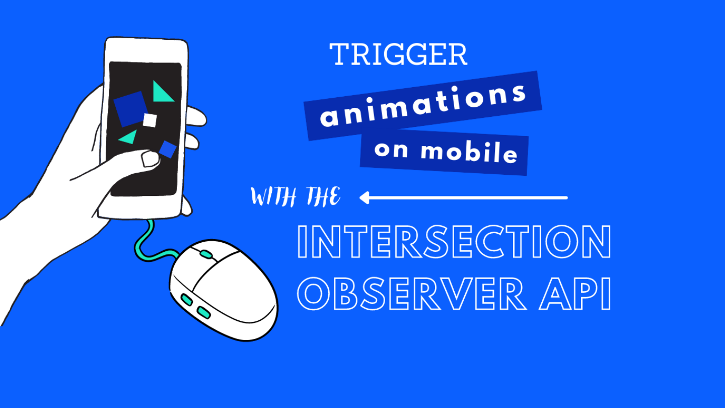
Trigger animations on mobile – with the Intersection Observer API

Hover does not work on mobile devices. Therefore, we use an alternative approach: the Intersection Observer API. When an element reaches a certain point in the viewport, an animation is triggered - like the hover effect on the desktop. Learn here how we developed the concept and what's the end result.
With the relaunch of our website, we didn’t just want to create an up-to-date redesign. We also wanted to express our company’s style and values throughout the website. That means using our component-based approach with Flynt and developing unique, custom highlights.
We are convinced that, when used correctly, micro animations can add a lot of value to a website experience. In a grid-component on the Bleech Homepage, we wanted the user to trigger the SVG animation when hovering. It turned out to be an amazing experience for desktop devices!
On the contrary – surprise surprise – mimicking a hover effect on mobile devices is just not part of their natural behavior.
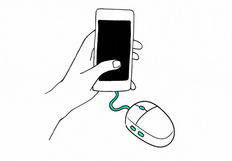
Wouldn’t it be nice to connect a mouse on a smartphone? But let’s be realistic 😉 A mouse for mobile devices is not the solution visitors would be really interested in.
Instead we found the Intersection Observer API as another approach to trigger a specific animation on mobile: The observer determines when an element reaches a certain point on the viewport of the phone. When the element intersects with this point, the animation starts and keeps running as long as the intersection is happening.
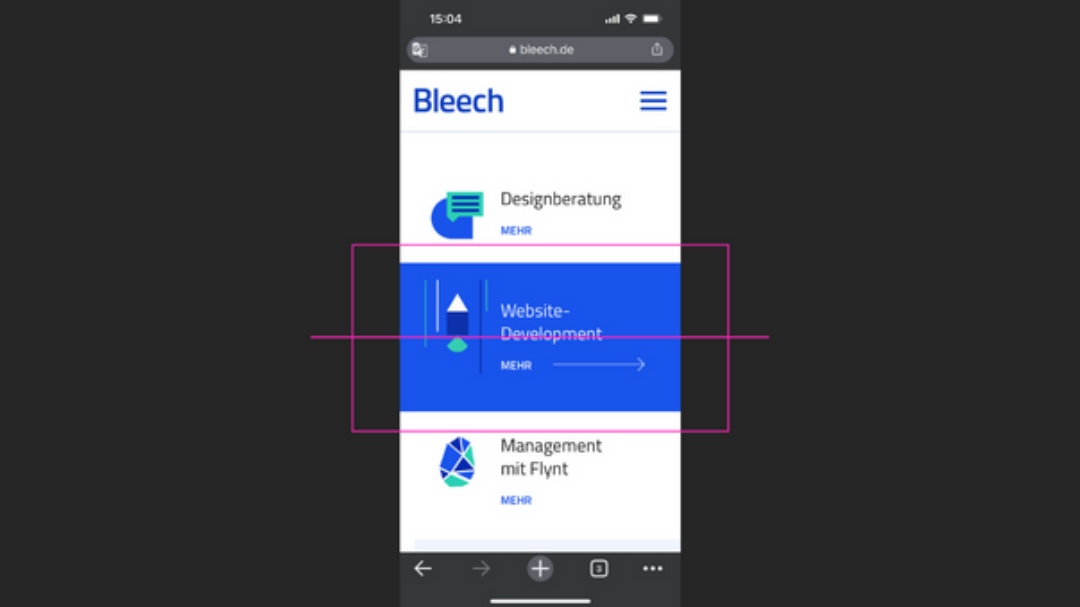
Only in the selected area of the animation will be executed.
Our solution works only if the element for which you want to activate an effect is single in a row. For example, if there are two buttons in a row next to each other, the hover effect would be activated for both of them at the same time.
As mobile traffic is king these days, we wanted to make sure that the UX is still guaranteed. Read here how our developer Alex came up with a solution and how he optimized the result:
First approach: Default Desktop
A long press on animated elements
How it works: By default, a long press on mobile devices triggers the mouseenter and mouseleave events that were used to start the animation on desktop devices.
Why it didn’t work for us: It became obvious fairly quickly this wasn’t the way to go. A long press on mobile elements is usually meant to bring native browser options on top of elements. And even though sometimes while scrolling, the animations would start, it was merely accidental. Not a good user experience at all.
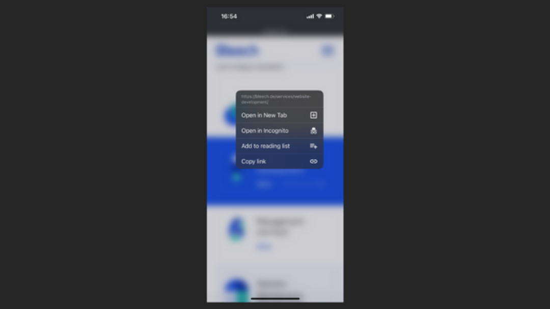
A long press on mobile elements brings native browser options on top of elements.
Second approach: Two‑step touch
Trigger animation on first touch and use second touch for link
How it works: We considered the first touch on the elements to start the animation, and the second touch on the same element to trigger the link action. When clicked once, the animation starts. It keeps running until there’s a second touch outside the component’s area or when another animated element is first touched. This restarts the animation in that newly clicked element and the cycle continues.
Why we decided against it: This method made it a challenge to stop currently running animations on siblings, but most importantly, it seemed again counterintuitive. After all, the goal of the component is first and foremost to lead the user to a subpage. As nice as an animation may be, the user shouldn’t have to click twice to reach the link goal.
Final approach: The Intersection Observer API
Start animation when it reaches a certain point in the viewport
How it works: We use the the Intersection Observer API to determine when an element reaches a certain point on the viewport. When the element intersects with this point, the animation starts and keeps running as long as the intersection is happening. Not bad!
What we optimized: There’s only one more thing to tackle with this approach: make sure the mouse events set for desktop devices are not starting animations on mobile devices. This would mean two elements can have animations started at the same time (one by the observer and another one by a random screen press).
Here’s how the final result looks like:
You are currently viewing a placeholder content from YouTube. To access the actual content, click the button below. Please note that doing so will share data with third-party providers.
More InformationAfter Alex came up with the final code, we reached the user experience we were looking for. We love this approach! Enjoy too: check out the animations on the homepage of Bleech on your mobile device. Don’t forget to compare them with desktop. How do you like it?
If you are as passionated as Alex is, why don’t you join us? At Bleech you have room to try out new solutions like this and work with the best WordPress developers. Check out our jobs section. You don’t live in Berlin? No problem, you can work 100% remote.