in UX / UI
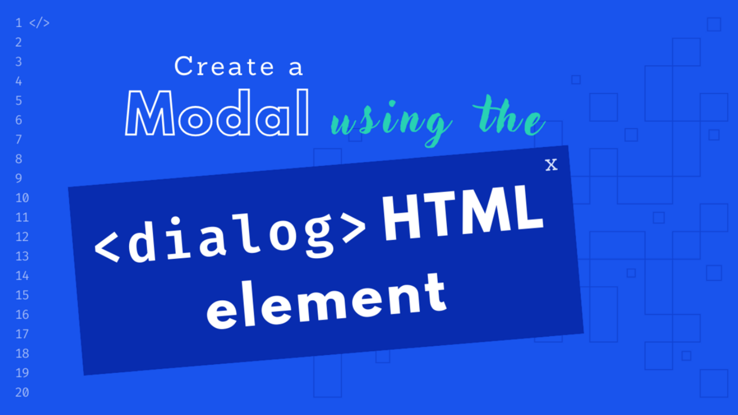
Creating a modal using the dialog HTML element

Making modals used to be hard and complicated, not anymore! Things got a whole lot easier once the dialog element came into play. In this article you'll learn how to create reusable modals with the native dialog HTML element.
Introduction
Back in the day, making a modal was a real challenge that needed loads of work and know-how. You had to really think about how to make it easy to use and accessible, deal with where the focus goes, handle keyboard events, and all that jazz. But things got a whole lot easier once the dialog element came into play.
The purpose of the <dialog> element is to simplify the processes of creating modals or floating interactive elements that appear on user interaction. A dialog will interrupt the typical user flow, usually to display important information, collect user input, or confirm actions.
Here is a simple example on how the dialog works:
<dialog id="dialog">
  <h2>Lorem ipsum</h2>
  <p>Lorem ipsum dolor, sit amet consectetur adipisicing elit. Facere mollitia iste, praesentium sint expedita culpa, veniam dolorem ipsam alias iusto labore quas, quia non minima repellendus. Excepturi laboriosam harum sunt.</p>
  <button id="close-dialog">Close</button>
</dialog>

<button id="open-dialog">Open Dialog</button>

<script>
const dialog = document.getElementById("dialog");
const dialogOpen = document.getElementById("open-dialog");
const dialogClose = document.getElementById("close-dialog");

dialogOpen.addEventListener("click", () => {
  dialog.show();
});

dialogClose.addEventListener("click", () => {
  dialog.close();
});
</script>
And that’s it. There are two methods you can call to open the dialog.
dialog.show()– Displays the dialog without a backdrop positioned absolute relative to the document flow.
dialog.showModal()– Displays a modal-type dialog in a fixed position with a backdrop, blocking interactions with the regular flow.
Closing the modal on background clicks
When dialogs are used to provide information or an action that is not mandatory for the user experience, it is a good idea to make the dialog easily dismissible. The following example shows how to close the modal when clicking anything outside of the dialog element.
const dialog = document.getElementById("dialog");
const dialogOpen = document.getElementById("open-dialog");
const dialogClose = document.getElementById("close-dialog");

dialogOpen.addEventListener("click", openDialog);
dialogClose.addEventListener("click", closeDialog);

function openDialog() {
  dialog.showModal()
  dialog.addEventListener("click", closeDialogOnClickOutside)
}

function closeDialog() {
  dialog.close()
  dialog.removeEventListener("click", closeDialogOnClickOutside)
}

function closeDialogOnClickOutside (event) {
  event.target === dialog && closeDialog()
}
Wrapping the content of the dialog with a div ensures that the event.target is not the dialog when the user clicks on the content. This is what makes the closeDialogOnClickOutside functions a one liner.
<dialog id="dialog" class="modal">
  <div class="modal-content">
    <h2>Lorem ipsum</h2>
    <p>Lorem ipsum dolor, sit amet consectetur adipisicing elit. Facere mollitia iste, praesentium sint expedita culpa, veniam dolorem ipsam alias iusto labore quas, quia non minima repellendus. Excepturi laboriosam harum sunt.</p>
    <button id="close-dialog">Close</button>
  </div>
</dialog>

<button id="open-dialog">
  Open Dialog
</button>
After taking care of the markup we will need to remove any padding around the dialog element and style the .modal-content instead.
/* Dialog Reset */
dialog {
  border: 0;
  padding: 0;
  background: transparent;
  max-inline-size: min(65ch, 100% - 3rem);
}

.modal-content {
  padding: 2rem;
  background-color: #fff;
}
Creating a component
I like looking at web development as this big puzzle. We usually like to create patterns that we can use to connect 4 worlds: HTML, CSS, JavaScript and Data. We create (puzzle) pieces of reusable code that we then connect to create interfaces. One of the most common patterns in the frontend world is Components.
Below, I’ve created an example on how I would structure my code to create a reusable modal component using plain HTML, CSS and JavaScript. You can also find a Flynt Component that you can drop into your project right away: View on GitHub.
Why you should use it
- Accessibility: The
<dialog>element is designed to be accessible, making it a valuable choice for developers committed to creating inclusive web experiences. It follows best practices for keyboard navigation and screen reader compatibility. - Ease of Use: Implementing a modal dialog with
<dialog>is straightforward. You only need to define the dialog’s content within the element, set its ID, and handle its display and interaction through JavaScript. - Focus Management: The
<dialog>element automatically manages the focus within the dialog, preventing users from tabbing outside the modal, which is essential for accessibility and a smoother user experience. - No dependencies: No need to load any external JavaScript libraries.
Why you might want to avoid the dialog element
The dialog element can be a useful tool in certain situations, but there are cases where it might be more suitable to use a JavaScript library or framework instead. Here are some scenarios when you might want to avoid using the <dialog> element and opt for a library or framework:
- Legacy Browser Support: If your project requires support for older browsers (mainly Internet Explorer) that do not support the
<dialog>element, using a JavaScript library can be the only viable option to implement modal dialogs. - Complex Interactions: If your modal dialogs involve complex interactions, such as multi-step forms, dynamic content loading, or integration with other components, using a library like Solid, React, or Vue.js can help manage these interactions more effectively.
- Animations and Transitions: Creating smooth animations and transitions in modal dialogs may be challenging with just the
<dialog>element. JavaScript libraries often provide more advanced animation options and transitions that can enhance the user experience.
Conclusion
The <dialog> HTML element is a valuable addition to the web developer’s toolkit. It simplifies the creation of modal dialogs while maintaining accessibility and user-friendliness. By following best practices and integrating it seamlessly into your web applications, you can enhance the overall user experience and make your interactions more intuitive and engaging.
But what about you? Have you used the dialog element? IIf so, what did you like or didn’t like about it? Reach out on 𝕏.