in UX / UI
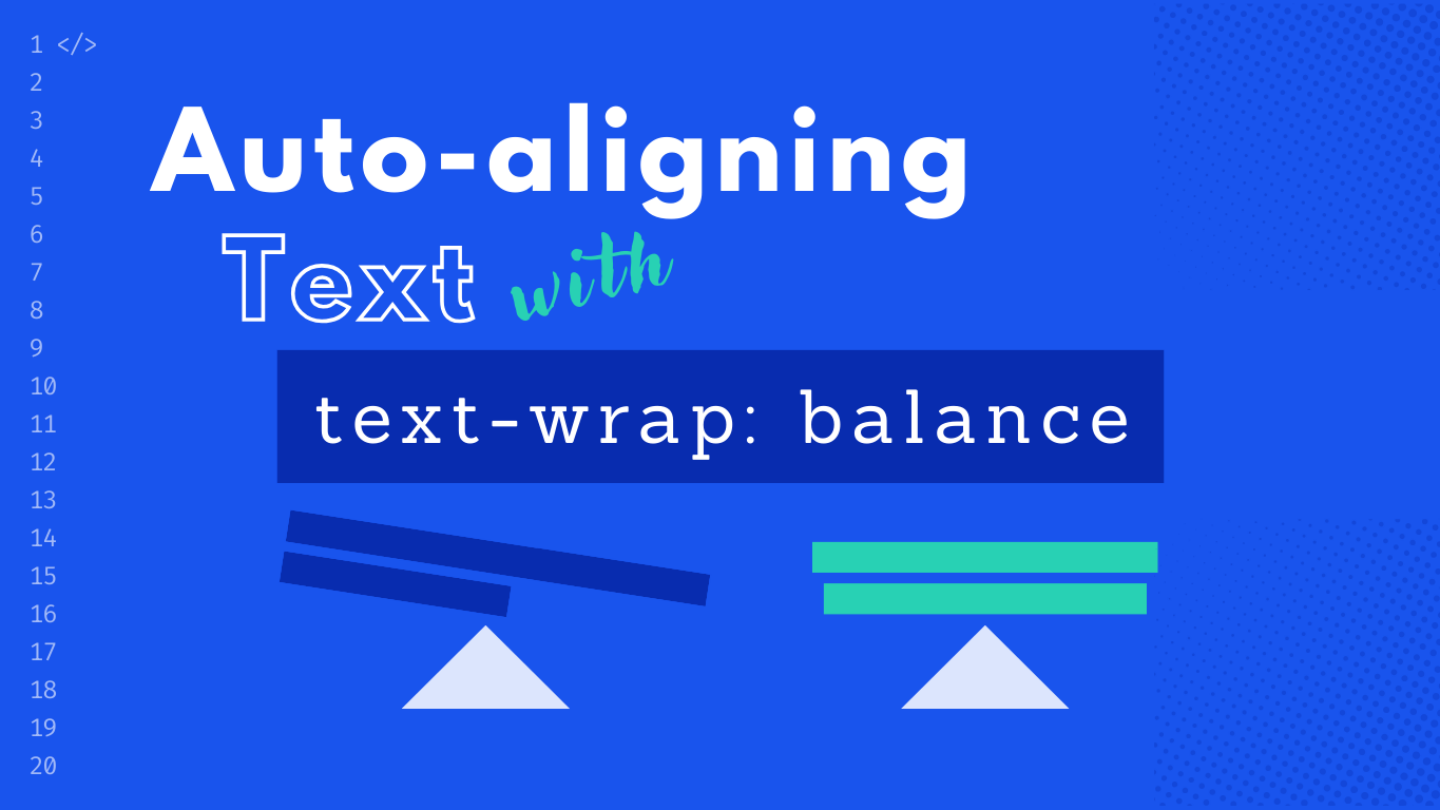
The ups and downs of text-wrap: balance and a polyfill

Balancing text lines in a responsive layout used to be hard. But no longer! With text-wrap: balance, automatic text composition is coming to the browser. Learn its limitations, browser support, and get a first look at its new sibling, text-wrap: pretty.
Copying and pasting text from a website design to a WordPress backend rarely results in a flawless result. Designers often balance multi-line headlines, a level of detail that’s hard to replicate on a responsive website without applying clever hacks – until now.
Say hello to text-wrap: balance! It takes you from hand-authoring to full automation, ensuring your text looks just as good online as it does in the design.
What is balanced and unbalanced text?
An unbalanced headline fills the entire container width for each line before breaking onto the next. This often results in the last line of text being shorter than the previous lines, unless you get lucky with perfect alignment.
.unbalanced {
  max-inline-size: 700px;
}
To balance all lines of text, you’d usually have to manually insert line breaks or adjust the container’s width. However, these methods only work for a predetermined layout width and have their limits with responsive layouts.
That’s where text-wrap: balance comes into play – it automatically aligns the length of text lines across all screen resolutions.
.balanced {
  max-inline-size: 700px;
  text-wrap: balance;
}
Technical limitations
Luckily text-wrap: balance does not require a dictionary for each language, which might render it useless for non-English content – I’m looking at you, hyphens: auto!
Instead, the browser calculates the smallest width for each line without creating additional lines. However, there are at least the following considerations to keep in mind when using this feature:
- Performance: The computational load increases with each added line. That’s why Chrome caps the limit for this feature support at six lines per element.
- Interference of white-space: It wont’t work if a specific
white-spacevalue is set. If the element inherits such value, you shouldunsetit. - Honoring manual line breaks: It will respect inserted
<br>-tags, so your intentional line breaks won’t be disrupted.
I consider these prerequisites as a plus. Initially, I was concerned that text-wrap: balance might be too “magical,” making it difficult to understand and debug. But especially the fact that it respects manual line breaks eases those worries.
Browser support
As of September 2023, Chromium-based browsers like Chrome and Edge support text-wrap: balance. However, there’s no support for Safari and Firefox in sight yet.
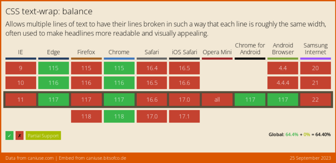
Browser support (September 2023)
Use cases: When text-wrap: balance shines
Given the limited browser support, text-wrap: balance is an ideal candidate for progressive enhancement. I think it’s great when a headline plays a key role in the layout, but the content manager cannot control its line breaks.
This might be the case for an article title that is displayed in a hero section on top of a larger background, especially when the headline is centered.
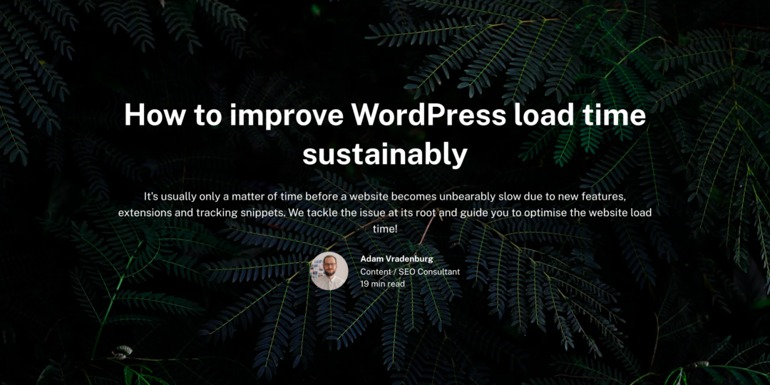
After: Balanced text in a blog post hero section, thanks to text-wrap: balance.
Once browser support expands – or if you opt for a polyfill – the applications could be extended to any layout-centric headline that is aiming for a block-style aesthetic.
Caution: why it’s not a silver bullet
Before you throw text-wrap: balance on every headline across your website, hear me out. Initially, I thought, “Why not? It can only improve layouts.” But that’s not necessarily the case, and here’s why, in two key points:
Caveat #1:
Loosing sight of unsupported browsers
When editing content in a supported browser, you won’t notice how bad a line of text may appear to users on unsupported browser. And when text composition makes a difference, I’d prefer the opportunity to catch these issues early and make necessary adjustments. This could mean adding an extra line break, tweaking the CSS, or even rewording the text.
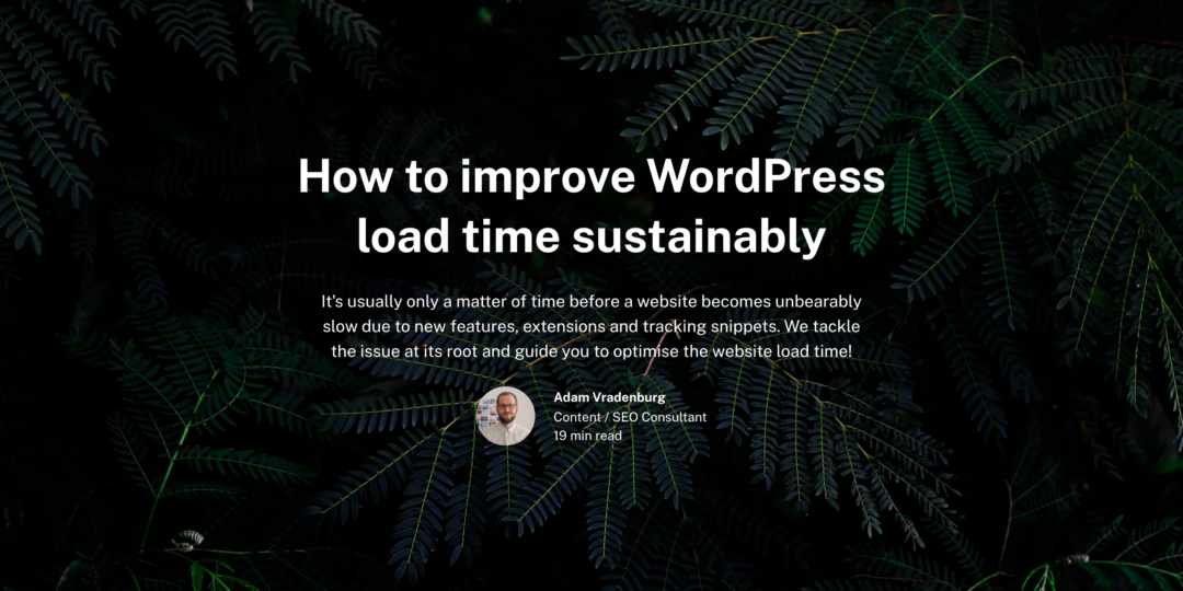
Before: The text layout looks significantly different without browser support.
Caveat #2:
Negative space alters the perceived layout
Humans instinctively read negative space as patterns. Our perception automatically frames multiple lines of text in a box, depending on where those lines break. Therefore, changing the length of lines affects the perceived size of a section. This effect becomes increasingly evident when the original text is highly unbalanced, such as when the last line contains only few characters.

Before: Unbalanced text fills the width of the parent container.

After: Balanced text causes notable white space on the right hand side.
A lightweight polyfill
The go-to JavaScript polyfill for many is Adobe’s balance-text. However, we found it to be outdated and a bit bloated for our needs. So, Dominik took matters into his own hands and crafted a custom polyfill. He based it on react-wrap-balancer, opting for a lighter, more streamlined algorithm that leverages modern tech like the ResizeObserver.
export default function () {
  if (!window.CSS.supports('text-wrap', 'balance')) {
    const elements = document.querySelectorAll('.textWrapBalance, h1')
    const resizeObserver = new ResizeObserver((entries) => {
      entries.forEach((entry) => {
        relayout(entry.target)
      })
    })
    elements.forEach((element) => {
      relayout(element)
      resizeObserver.observe(element)
    })
    window.addEventListener('resize', () => {
      elements.forEach((element) => {
        relayout(element)
      })
    })
  }
}

function relayout (wrapper, ratio = 1) {
  const container = wrapper.parentElement

  const update = (width) => (wrapper.style.maxWidth = width + 'px')

  wrapper.style.display = 'inline-block'
  wrapper.style.verticalAlign = 'top'
  // Reset wrapper width
  wrapper.style.maxWidth = ''

  // Get the initial container size
  const width = container.clientWidth
  const height = container.clientHeight

  // Synchronously do binary search and calculate the layout
  let lower = width / 2 - 0.25
  let upper = width + 0.5
  let middle

  if (width) {
    // Ensure we don't search widths lower than when the text overflows
    update(lower)
    lower = Math.max(wrapper.scrollWidth, lower)

    while (lower + 1 < upper) {
      middle = Math.round((lower + upper) / 2)
      update(middle)
      if (container.clientHeight === height) {
        upper = middle
      } else {
        lower = middle
      }
    }

    update(upper * ratio + width * (1 - ratio))
  }
}
To integrate the polyfill into your Flynt project, create a new script file in the /assets/scripts/ folder. Paste the above code snippet into it and adjust the selector according to your needs.
/assets/scripts/textWrapBalance-polyfill.jsIn order to execute the polyfill code, add the following to your main.js file:
import textWrapBalance from './scripts/textWrapBalance-polyfill.js'
textWrapBalance()
Conclusion
Overall, I’m a big fan of text-wrap: balance and would use it across the board if only browser support were great.
But the idea of running intense CSS manipulations in JavaScript on practically every page just to polyfill this feature doesn’t sit well with me at the moment.
So, for now, I’ll keep an eye out for specific use-cases where its native capabilities can progressively enhance the user experience, while holding off on broader implementation until robust browser support arrives.
Meet its sibling text-wrap: pretty
Beyond the balance value, the spec offers a new pretty value which is supposed to prevent single words at the end of a new line.
In a nutshell, if balance is for layout headlines, then pretty is your go-to for content headlines. But it could also be a solid choice for layout headlines where you prefer to keep the negative space largely unchanged, as mentioned above.
Support for text-wrap: pretty shipped in Chrome 117 first.

text-wrap: pretty: Prevents a single word in the headline’s last line.
Btw: This page uses text-wrap: balance on the h1 and text-wrap: pretty on long-copy content headlines (.post-main h1-h6).


 powered by Borlabs Cookie