in Pagespeed
Lighthouse 10 Update – Mobile device size changed

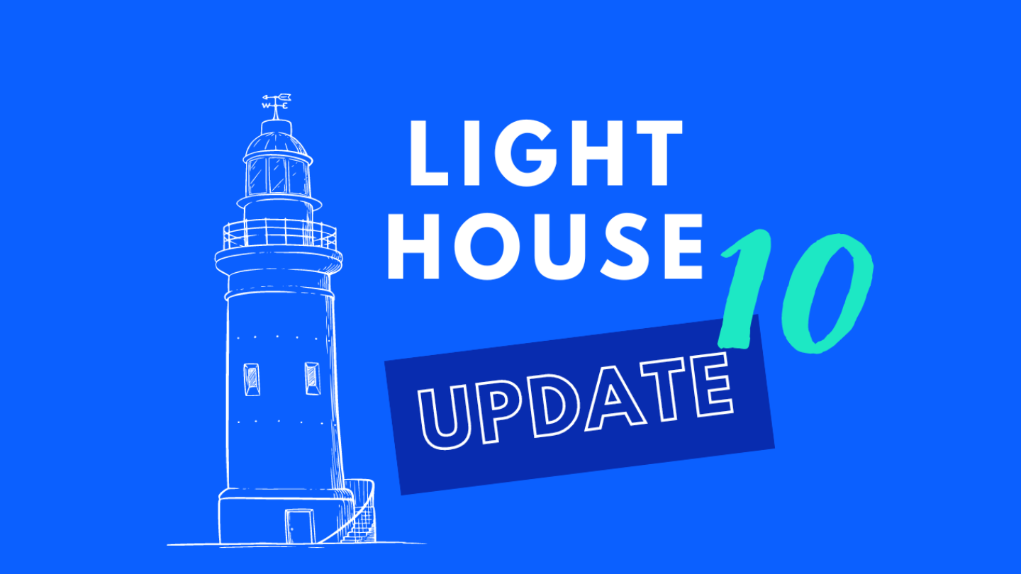
Google’s Lighthouse tool has been updated to version 10 in early 2023, and includes important changes to the way page speed scores are calculated. On closer inspection, we’ve noticed that the mobile device used for testing has changed. This change hasn’t been announced. Learn here, why it’s a significant change.

You are currently viewing a placeholder content from YouTube. To access the actual content, click the button below. Please note that doing so will share data with third-party providers.
More InformationListen to the Lighthouse 10 podcast episode to find out more about the changes in Lighthouse 10.
Lighthouse is an open source, automated tool for improving the quality of web pages. You can run it against any website without authentication. It has checks for performance, accessibility, progressive web applications, SEO and more. While Core Web Vitals provides metrics based on field data, Lighthouse provides metrics based on simulation.
Mobile device size changed
We have noticed that a new device is being used for the Lighthouse mobile test. It used to be the Moto G4 and now it’s the Moto G Power. That means the new size width of the device is 412px x 823px.
This is important to know to get the best Page Speed result on a website. Just recently it happened to us that we tested a site in Lighthouse 10 and it reported a Cumulative Layout shift. We didn’t see that happen on the Moto G4 viewport width of 360px. However, on the larger Moto G Power viewport width of 412px, the line breaks of the text changed during the rendering process, causing the CLS.
Tipp: If you hover over the device in Lighthouse, it will show you the resolution.
Share this news with others and watch the Lighthouse 10 podcast episode to get all the details!
Time to Interactive (TTI) is removed
The Time to Interactive (TTI) metric measures how long it takes for a page to become fully interactive. This metric has been removed in Lighthouse 10 and its 10% weighting has been moved to Cumulative Layout Shift (CLS).
In an analysis of 13 million page loads in the latest HTTP Archive run, 90% of those pages would see an improvement in their Lighthouse performance score.
Chrome Developers
Cumulative Layout Shift (CLS) increased
The weight of CLS is now 25%. Its previous weight was 15%. This means that most sites will achieve better page speed performance in Lighthouse.
CLS measures how visually stable a website appears. Is there any unexpected movement of web elements such as an image, button or text as the page load? For example, it’s annoying if you’re navigating through a page and the page jumps because an ad is loading asynchronously. You mean to click a button on the page, but end up clicking the ad.
The Chrome developer team expects about 90% of sites to see an improvement in their Lighthouse performance score. This is probably because many sites load a lot of heavy JavaScript, which slows down the TTI, but have a comparatively better CLS. However, because of the increased weighting of CLS, sites that previously had a poor CLS score will see their overall page speed score drop even further.